Branding Schrodinger

SchrodingerBranding Header Image

The Opportunity

After Schrödinger LLC, a  small chemistry software company received a much-needed injection of cash from David Shaw, marketing director Shi-Yi Liu reached out to us in 2001 for help. Shaw felt that the existing marketing collateral looked far too “mom and pop”. He wanted to see professionally designed brochures, product branding and packaging,

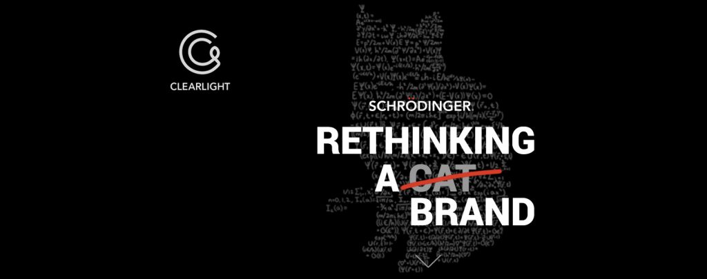
Schrödinger’s initial logo featured a whimsical black leopard striding across the top of its logotype, a nod to its namesake, Irwin Schrödinger, who had used the analogy of a cat in a black box with a vial of cyanide to illustrate his principle of quantum mechanics. If the vial is intact the cat lives, if not, the cat dies.


The Great Cat Debate

One of the first casualties of this process was their ubiquitous logo, which, for 10 years, had featured a stalking jaguar.

Schrödinger scientists loved the cat–it immediately associated them with Quantum Theory in an affectionate and humorous way.

Unfortunately, the direction of logos in the early 2000s was moving towards ultra-simple, clean, non-whimsical shapes, icons, swooshes, letters, or logotype only. We had doubts about the long-term viability of the cat logo for a growing company.

Working with the cat

Our first efforts attempted to work with the cat. They resulted in sales collateral that had a “mom and pop” feel.

Tasked with creating clean, modern, professional branding, we felt that the cat had to go. Our first challenge then, was not selling our client on the look and feel of our new brochure designs–no, it was all about retiring the Schrödinger cat!.

Once that issue was settled Clear Light continued to develop product packaging, branding, Ads, and 3 websites for Schrödinger over the course of nearly 14 years.

Early "Glide" brochure

Beta Sans font selected for all products is the one branding element that's been stable over the years

Jaguar Brochure with new Logo

A geometric pattern is used throughout all brochures with the new logo, in keeping with the preferences of investor David Shaw.

New Beginnings

The initial brochure was an improvement over the Company’s prior geeky marketing materials. But they fell short of the design standard we were looking to establish.

We finally convinced Schrödinger to let us work with the logo and to develop a cleaner style, in this case built around a geometric “Mondrian-esque” grid, with a small window displaying a unique molecular structure related to the product.

We used a modified Avenir font to render the logo. We considered it transitional, but it has persisted in various forms over the past 18 years.

Over time Schrödinger moved towards larger, lusher images, increased white space, and mainly bullet point layout for text.

Schrödinger has also acquired various outside products, such as PyMol and developed in-house products that were not part of their molecluar modeling suites. These were branded on an individual basis, as seen below right.

Leave a Reply

Your email address will not be published. Required fields are marked *