Rethinking a Cat Brand


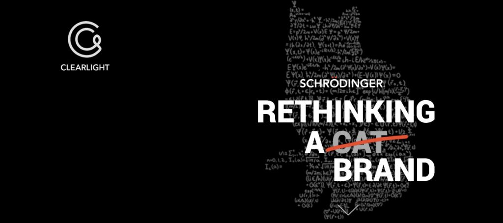
Schrödinger is named after Irwin Schrödinger, a Swiss scientist whose work was vital in establishing the branch of science known as quantum mechanics.  Schrödinger had used the analogy of a cat in a black box along with a vial of cyanide to illustrate his theory. If the vial might is intact the cat lives, if it breaks, bad luck for the cat. Schrödinger’s logo was a whimsical cat stalking above its logotype.


Schrödinger scientists loved the cat. Unfortunately, the direction of logos in the early 2000s was moving in the opposite direction–towards ultra-simple, clean, non-whimsical memes, swooshes, icons, or just logotypes.

Killing off the cat at the outset was unthinkable. Clear Light did its best to work with the cat.


glide

First Effort

Clear Light’s first effort worked with existing branding and style guides. The result is clearly unsatisfactory for a company with international aspirations.


Building the Brand

After convincing Schrödinger of the need to move away from its existing branding, Clear Light first set out to develop strong product branding, employing a clean color-coordinated scientific-leaning (Beta Sans) font and bespoke, saturated branding colors throughout all sales collateral.


Building the Brand

Our first order of business was to create strong product branding for Schrödinger. We felt that a system, which employed a clean/strong color-coordinated scientific-friendly font was ideal, the the branding colors could be used throughout all sales collateral to delineate different products. We used Beta Sans and selected strong, saturated colors that stood out.


Lorem ipsum dolor sit amet, consectetur adipiscing elit. Ut elit tellus, luctus nec ullamcorper mattis, pulvinar dapibus leo.

Leave a Reply

Your email address will not be published. Required fields are marked *